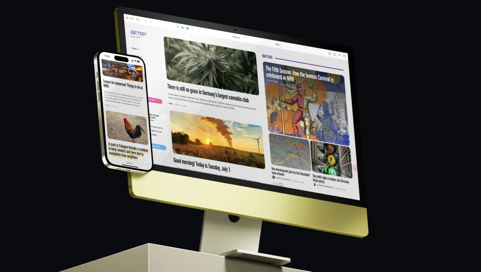
BETEP
Bridging the information gap for Russian speakers in North Rhine‑Westphalia.
- My role
- Founder, product designer and product lead
- Team
- 11 volunteer editors and an illustrator
- Platforms
- Website on WordPress, Telegram channel, Instagram
- Live site
- betep.de
BETEP (Veter, “wind” in Russian) is a news portal and community initiative for Russian speakers in North Rhine‑Westphalia, Germany. It started from my own problem, the information vacuum that new immigrants face, and grew into a website and a Telegram channel with local news, practical guides and events. Since then it has become a registered non‑profit association, BETEP e.V.

The problem
When I moved to Düsseldorf, I ran straight into an information vacuum. Getting relevant local news and understanding daily life in NRW was hard because of the language barrier and unfamiliar German websites. Without local news you feel cut off from the place you live in.
Many people I talked to had the same problem. The Russian‑speaking community was also split: political refugees, late repatriates, professionals and recent Ukrainian refugees lived in separate circles and had nowhere to meet.
No local news in their language
Hard to get local news and practical information in Russian.
Isolation
Not understanding local life made integration harder.
No convenient source
People wanted one aggregated source, ideally inside a familiar app like Telegram.
No place to meet
People needed a space to find other Russian speakers for support and social life.
My role
As founder I led the project from concept to launch and beyond, with a focus on product design and product management.
Problem definition and research
Understanding the core problem and the audience’s unmet needs.
Vision and strategy
Defining the mission, goals and roadmap.
Information architecture and UX
Structure and user flows for the website and the Telegram channel.
UI and visual design
Brand identity, responsive web design and social media assets.
Prototyping and iteration
Fast changes based on feedback and analytics, often straight in the CMS.
Team leadership
Managing volunteer content creators and an illustrator, keeping design consistent.
Analytics
Tracking key metrics to understand behaviour and find what to improve.
Feature development
Testing new features, such as LLM‑assisted writing and how‑to guides.
Product goals
Close the information gap
A reliable, easy‑to‑use source of news and practical information about NRW in Russian.
Build community
Connect a diverse diaspora through interaction, mutual help and shared culture.
Help integration
Give people the knowledge and resources to navigate life in Germany.
Make it easy to read
Short posts, a clear feed and the same look on the website, Telegram and Instagram.
Research
Large‑scale research wasn’t possible at the start, so I took a lean, qualitative approach.
Founder as user zero
My own experience gave the first deep insight into the problem.
Interviews and community listening
Informal conversations with dozens of Russian speakers in NRW, and watching Telegram groups for recurring questions like “Is there any Russian‑language news here?”
Implicit personas
Segments emerged: newcomers who need basic integration help, long‑term residents who want community news, families looking for things to do.
Competitive scan
The few Russian‑language resources in Germany were inactive, poorly maintained or full of ads, which left room for a quality platform.
Post‑launch feedback
Telegram polls and direct messages about geography, content preferences and pain points.
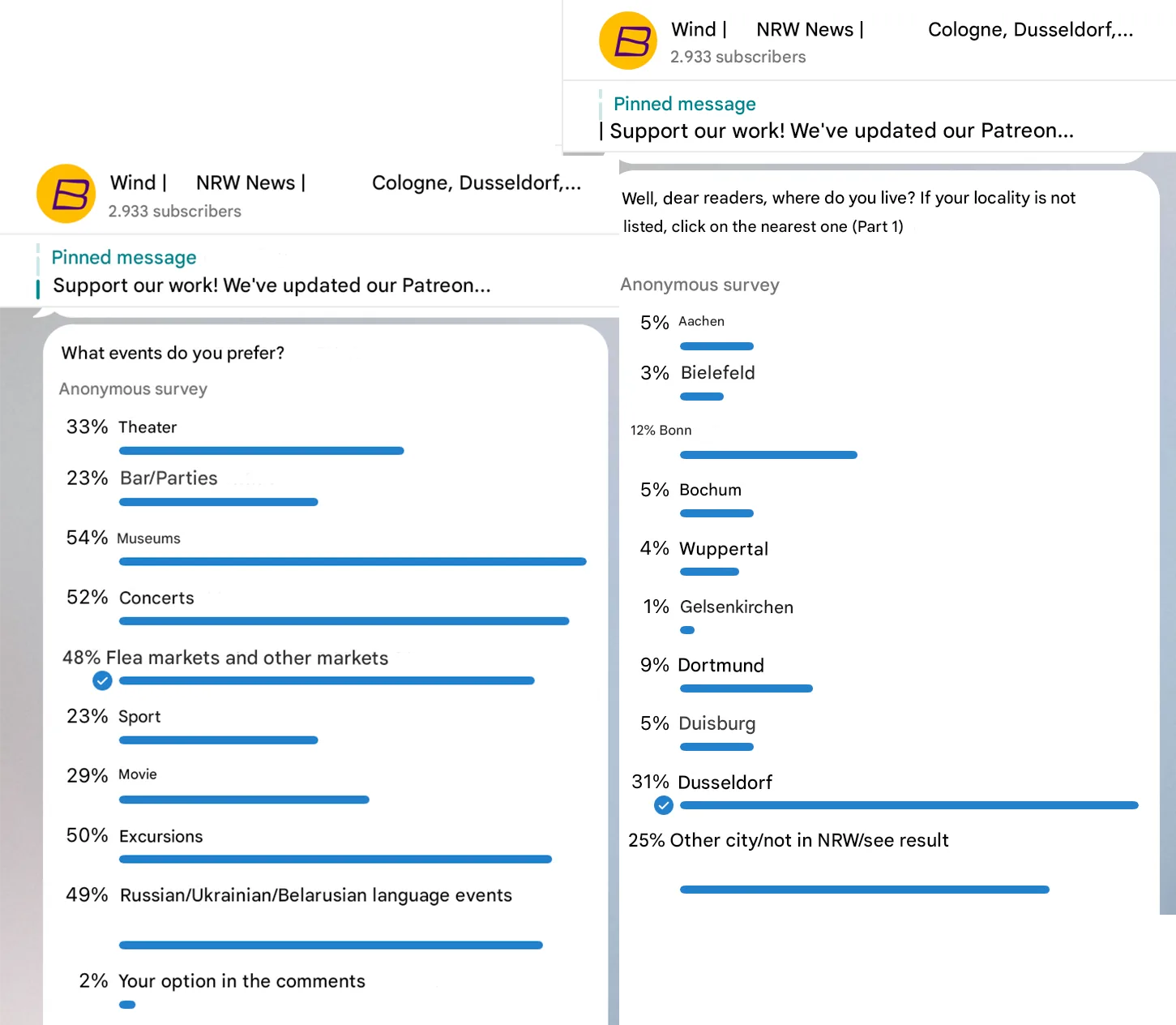
Key insight: even readers who speak some German preferred local news in Russian, delivered fast, in a feed they already use.
Telegram first
Telegram is popular with the audience, so the MVP was a Telegram channel. It launched fast, cost almost nothing to build and had readers from day one.
The UX work focused on clear message formatting, consistent post footers with links and tags, and a well‑defined channel description.

Expanding to a website
As the channel grew, a website became necessary to:
- be found through search engines,
- structure content with categories, archives and sections for long guides,
- look more credible,
- support richer formats: articles, event listings, embedded media,
- act as the hub for cross‑posting.
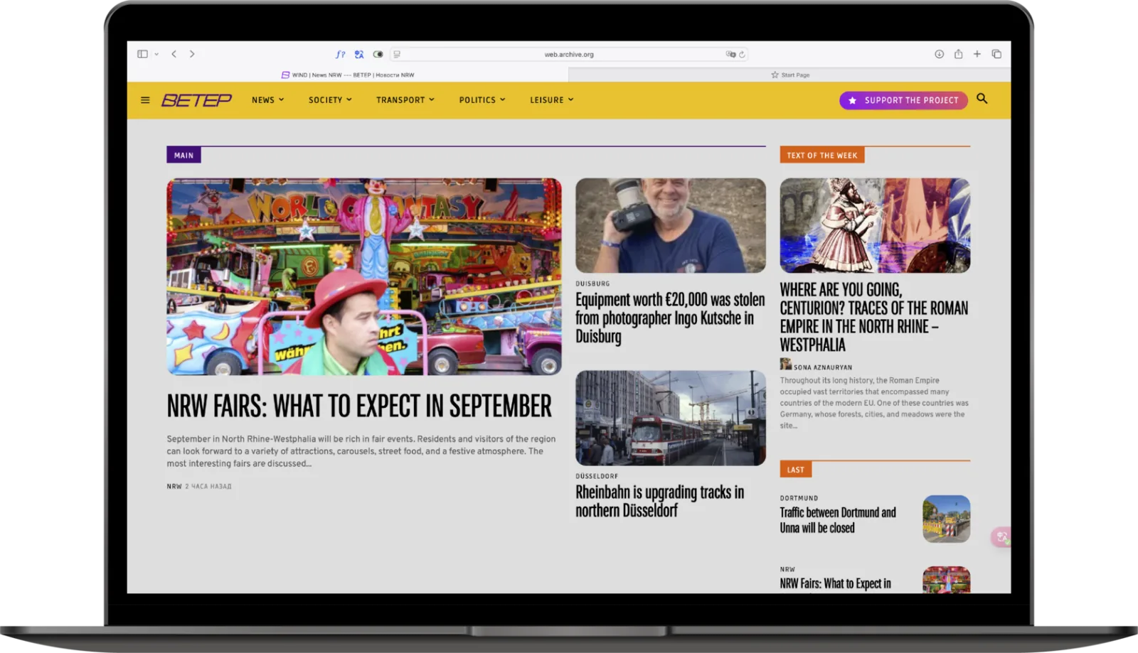
Website design
Platform
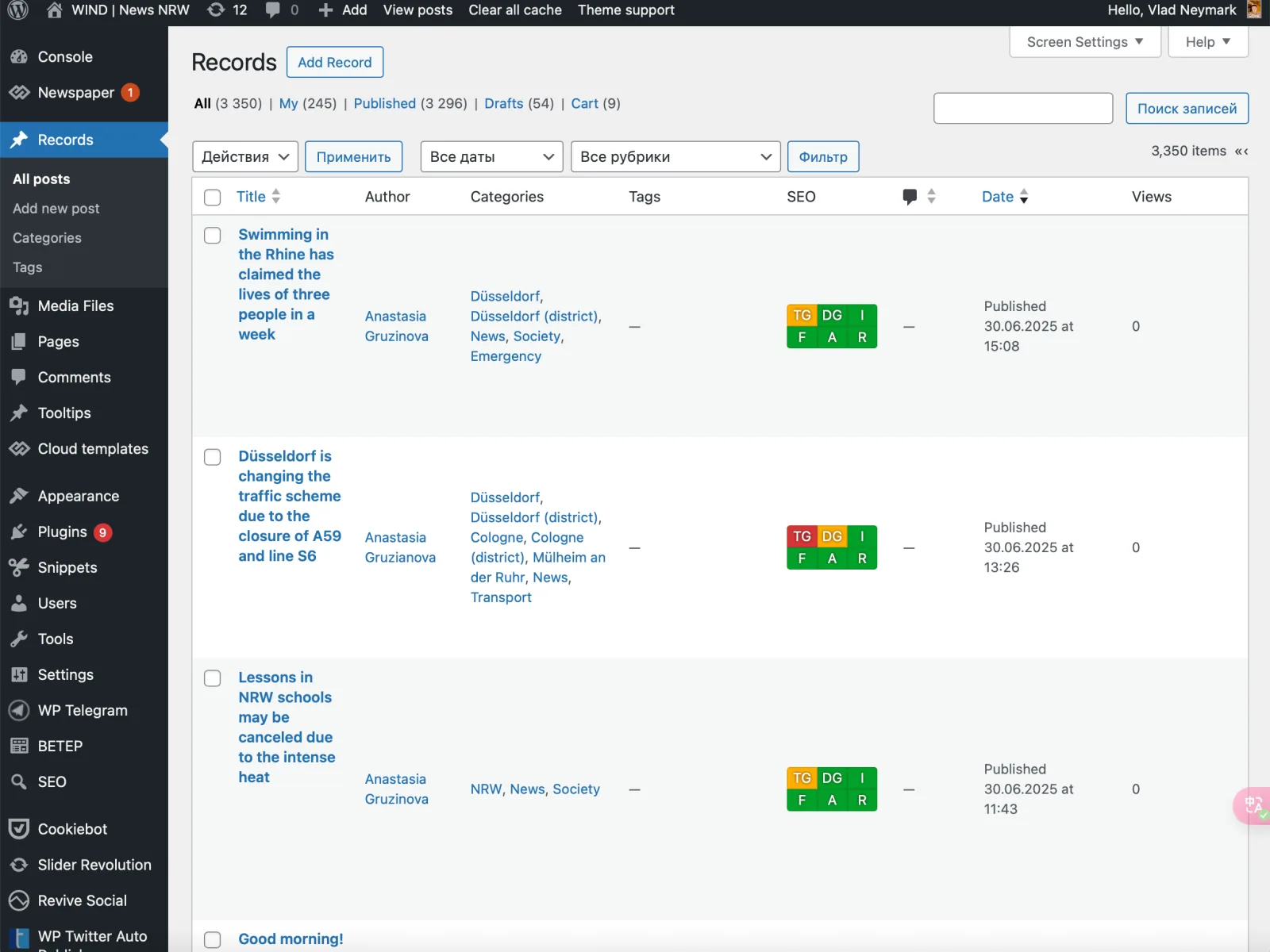
WordPress, for its CMS, plugins for SEO, analytics and cross‑posting, and an admin that volunteers can use without training.
Lean and iterative
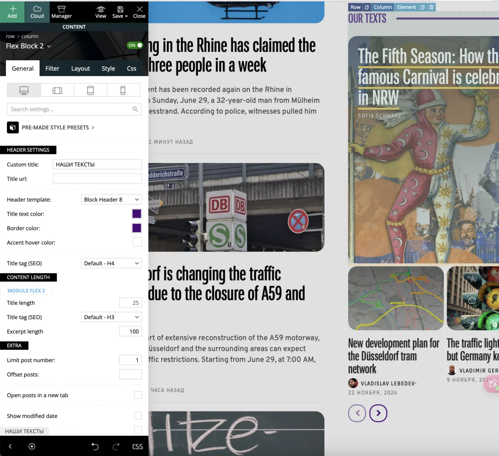
Instead of a long wireframing phase, I prototyped by customising a flexible WordPress theme and adjusting in the browser. The IA and key flows were mapped before visual work started.
Information architecture
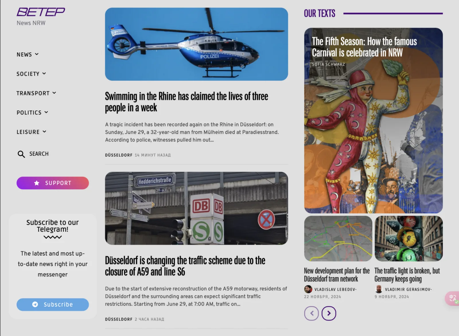
The structure mirrored the categories that worked on Telegram: news, leisure, our articles. The home page is a chronological feed, a familiar pattern for news. Leisure and in‑depth guides later got prominent sections.
Visual design
Branding
A logo and a yellow and purple palette. Vivid at first, later toned down for readability and a calmer feel, based on user feedback.

Typography
A narrow variable sans‑serif reminiscent of German DIN. It gives a subtle German feel, fits more words into headlines and stays readable on every device.
German signage
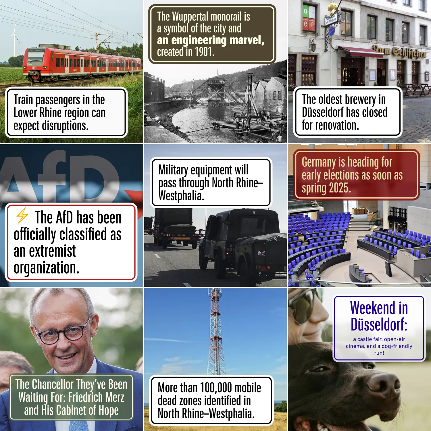
Early concepts borrowed from German information signs: white plates, black borders, narrow letters. That led to the typeface and the clean layout.

Illustration
With an illustrator, we developed a bright collage style for feature images that gives the platform its own look and warmth.

Key pages
Home page
The latest news in a scannable feed. On desktop, narrower image previews fit more headlines above the fold. Leisure gets a visual gallery.

Article page
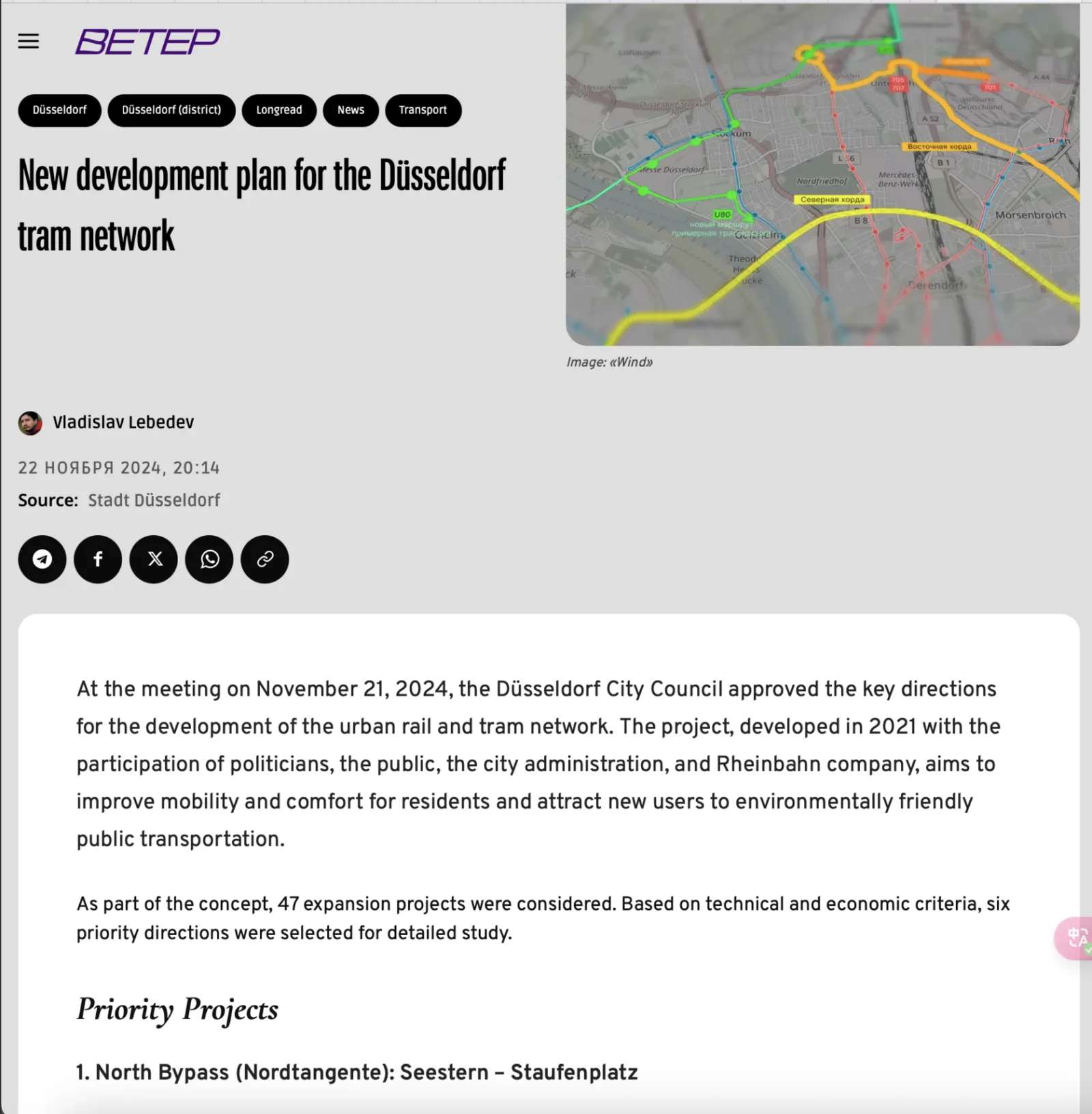
Headline and main image are visible immediately on any screen, side by side on desktop. A clear news source line was added after readers asked for transparency.
Navigation
On desktop, navigation moved into a sidebar. The header became cleaner and the “Follow us on Telegram” call to action got a permanent place.

Social media
Templates for Instagram news cards and event announcements. The first concept, black text on white with a border like a German sign, gained the brand colours. Posts became brighter and more recognisable while keeping the structured sign feel. Posting was automated where possible.


Technical integrations
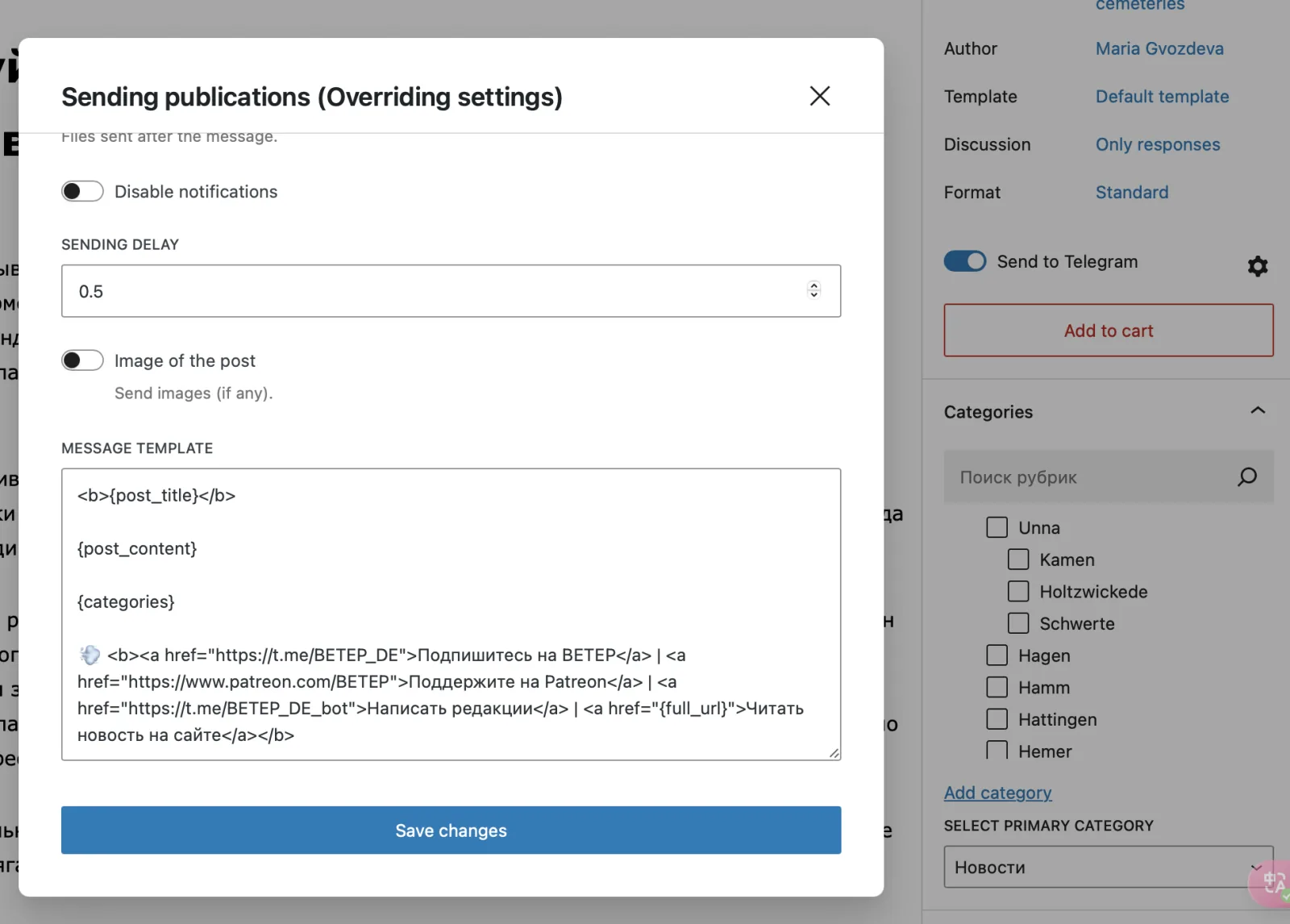
Automated cross‑posting
New articles go to Telegram, Twitter and Facebook automatically, with consistent formatting.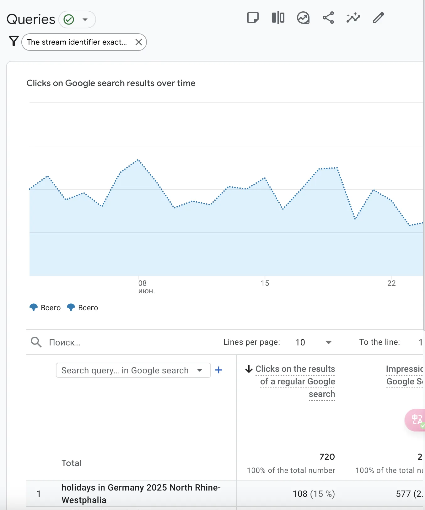
Analytics
Google Analytics tracks behaviour, content performance and traffic sources to guide design and content decisions.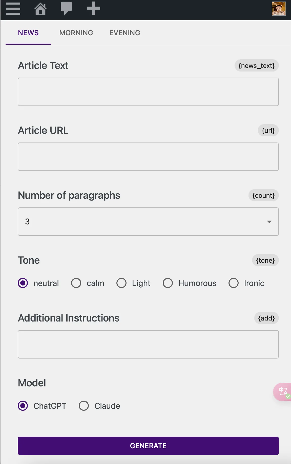
LLM writing assistant
I designed and built, with AI‑assisted coding, a WordPress plugin that helps volunteers draft news summaries. It is a big part of why 11 volunteers can publish eight posts a day.Iteration
The product kept changing through a build, measure, learn cycle.
UI refresh
A softer palette for visual comfort. The “top stories” block was removed in favour of a pure chronological feed, which readers found clearer. In‑depth guides got more visibility.
Article page
A dedicated news source field, added after readers asked for it.
Content pivot
From low‑engagement long reads to the how‑to guides people asked for, the “Veter Encyclopedia” about German bureaucracy and daily life.
Instagram visuals
From stark black and white to a colourful, more engaging style.
Publishing cadence
Eight posts a day at fixed times. Predictable for readers and easier for the team to prioritise.
Team structure
Trying volunteer roles such as image editor and events curator, and keeping what proved sustainable.
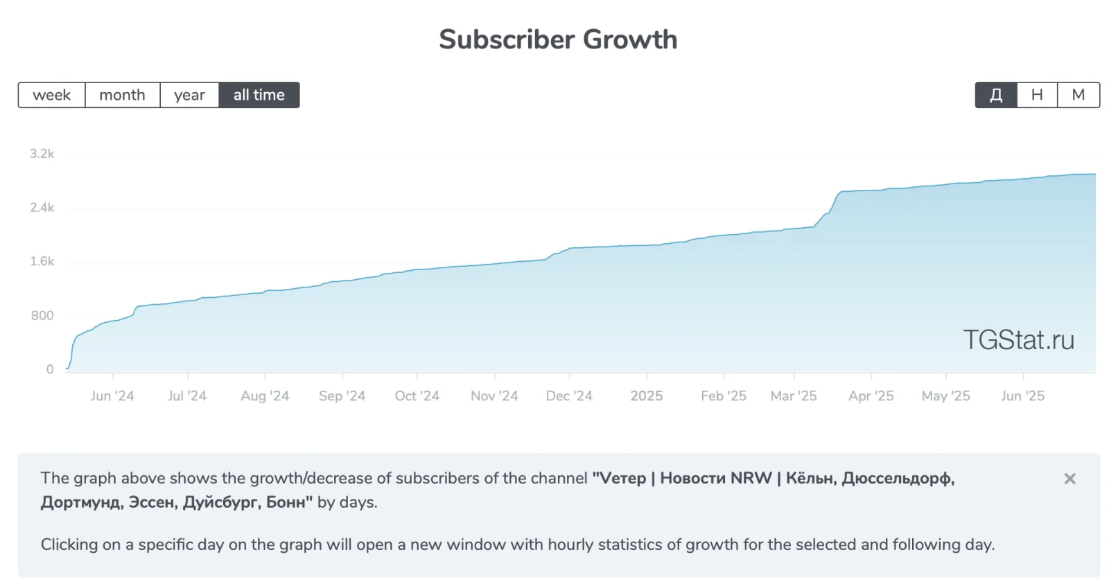
Impact
Recent monthly average.
Organic search 37.6k, direct 19.7k, social 3.4k.
The main place for daily interaction. Post errors are close to zero thanks to the editorial process.
What readers say
Consistent positive feedback on the daily leisure digests and practical guides. Some readers became more socially active by going to events featured on BETEP.
Community
A go‑to hub that raised awareness of local events, bureaucracy, politics and history, and so helped people integrate.
“Veter helped me understand local politics I wouldn’t have otherwise.”
“Thanks to your events list, I finally left the house and met new people!”
Challenges and learnings
Limited money and people
Bootstrapping meant relying on volunteers and personal investment, which ruled out heavier processes like moderated usability testing.
Learning: design lean processes and prioritise ruthlessly when resources are scarce.
Founder versus designer
Juggling strategy and hands‑on design meant less time for deep design exploration than I wanted.
Learning: define roles clearly even in a small team, and protect time for design.
Iterating on good enough
Launching an MVP was fast but created design debt to pay back later.
Learning: ship early and keep tracking feedback. Early technical choices, like hosting, stay with you for a long time.
The power of direct feedback
Without formal testing, Telegram comments and analytics became the main way to validate design decisions.
Learning: build feedback channels on purpose and treat every interaction as research.
What’s next
Use the association
BETEP is now a registered non‑profit (e.V.). Next is applying for grants and building memberships.
Expand the product
Build the Veter Encyclopedia of linked practical guides, try video and podcasts, improve the LLM assistant.
Scale to other states
Replicate the model in other German states with local teams.
Meet offline
Events and workshops to strengthen community ties.
Keep refining UX
Structured usability testing of key flows and a more scalable design system.
Conclusion
BETEP started because I couldn’t find local news in a language I read quickly. Today 11 volunteers publish eight posts a day for more than 13,000 readers a month, and the project is a registered association.